Data Visualisation with ggplot2
Last updated on 2024-03-12 | Edit this page
Overview
Questions
- What are the components of a ggplot?
- How do I create scatterplots, boxplots, and barplots?
- How can I change the aesthetics (ex. colour, transparency) of my plot?
- How can I create multiple plots at once?
Objectives
- Produce scatter plots, boxplots, and time series plots using ggplot.
- Set universal plot settings.
- Describe what faceting is and apply faceting in ggplot.
- Modify the aesthetics of an existing ggplot plot (including axis labels and color).
- Build complex and customized plots from data in a data frame.
Getting set up
Set up your directories and data
If you have not already done so, open your R Project file
(library_carpentry.Rproj) created in the
Before We Start lesson.
If you did not complete that step then do the following. Only do this if you didn’t complete it in previous lessons.
- Under the
Filemenu, click onNew project, chooseNew directory, thenNew project - Enter the name
library_carpentryfor this new folder (or “directory”). This will be your working directory for the rest of the day. - Click on
Create project - Create a new file where we will type our scripts. Go to File >
New File > R script. Click the save icon on your toolbar and save
your script as “
script.R”. - Copy and paste the below lines of code to create three new
subdirectories and download the original and the reformatted
booksdata:
R
library(fs)   # https://fs.r-lib.org/.  fs is a cross-platform, uniform interface to file system operations via R.
dir_create("data")
dir_create("data_output")
dir_create("fig_output")
download.file("https://ndownloader.figshare.com/files/22031487",
              "data/books.csv", mode = "wb")
download.file("https://ndownloader.figshare.com/files/22051506",
              "data_output/books_reformatted.csv", mode = "wb")
Load the tidyverse and data frame into your R
session
Load the tidyverse and the lubridate
packages. lubridate is installed with the tidyverse, but is
not one of the core tidyverse packages loaded with
library(tidyverse), so it needs to be explicitly called.
lubridate makes working with dates and times easier in
R.
R
library(tidyverse) # load the core tidyverse
OUTPUT
── Attaching core tidyverse packages ──────────────────────── tidyverse 2.0.0 ──
✔ dplyr     1.1.2     ✔ purrr     1.0.1
✔ forcats   1.0.0     ✔ stringr   1.5.0
✔ ggplot2   3.4.2     ✔ tibble    3.2.1
✔ lubridate 1.9.2     ✔ tidyr     1.3.0
── Conflicts ────────────────────────────────────────── tidyverse_conflicts() ──
✖ dplyr::filter() masks stats::filter()
✖ dplyr::lag()    masks stats::lag()
ℹ Use the conflicted package (<http://conflicted.r-lib.org/>) to force all conflicts to become errors
R
library(lubridate) # load lubridate
We also load the books_reformatted data we saved in the
previous lesson. We’ll assign it to books2.
R
books2 <- read_csv("data_output/books_reformatted.csv") # load the data and assign it to books
Plotting with ggplot2
Base R contains a number of functions for quick data visualization
such as plot() for scatter plots, barplot(),
hist() for histograms, and boxplot(). However,
just as data manipulation is easier with dplyr than Base R,
so data visualization is easier with ggplot2 than Base R.
ggplot2 is a “grammar” for
data visualization also created by Hadley Wickham, as an
implementation of Leland Wilkinson’s Grammar of
Graphics.
ggplot is a plotting package that makes it simple to
create complex plots from data stored in a data frame. It provides a
programmatic interface for specifying what variables to plot, how they
are displayed, and general visual properties. Therefore, we only need
minimal changes if the underlying data change or if we decide to change
from a bar plot to a scatterplot. This helps in creating publication
quality plots with minimal amounts of adjustments and tweaking.
ggplot2 functions like data in the ‘long’ format, i.e.,
a column for every dimension, and a row for every observation.
Well-structured data will save you lots of time when making figures with
ggplot2
ggplot graphics are built step by step by adding new elements. Adding layers in this fashion allows for extensive flexibility and customization of plots.
To build a ggplot, we will use the following basic template that can be used for different types of plots:
ggplot(data = <DATA>, mapping = aes(<MAPPINGS>)) + <GEOM_FUNCTION>()- use the
ggplot()function and bind the plot to a specific data frame using thedataargument
When you run the ggplot() function, it plots directly to
the Plots tab in the Navigation Pane (lower right). Alternatively, you
can assign a plot to an R object, then call print()to view
the plot in the Navigation Pane.
Let’s create a booksPlot and limit our visualization to
only items in subCollection general collection, juvenile,
and k-12, and filter out items with NA in
call_class. We do this by using the | key on the
keyboard to specify a boolean OR, and use the !is.na()
function to keep only those items that are NOT NA in the
call_class column.
R
# create a new data frame
booksPlot <- books2 %>%
  filter(subCollection == "general collection" |
           subCollection == "juvenile" |
           subCollection == "k-12 materials",
         !is.na(call_class))
ggplot2
ggplot2 functions like data in the ‘long’
format, i.e., a column for every dimension, and a row for every
observation. Well-structured data will save you lots of time when making
figures with ggplot2
ggplot graphics are built step by step by adding new elements. Adding layers in this fashion allows for extensive flexibility and customization of plots.
To build a ggplot, we will use the following basic template that can be used for different types of plots:
ggplot(data = <DATA>, mapping = aes(<MAPPINGS>)) + <GEOM_FUNCTION>()Use the ggplot() function and bind the plot to a
specific data frame using the data argument.
R
ggplot(data = booksPlot) # a blank canvas

Not very interesting. We need to add layers to it by defining a
mapping aesthetic and adding geoms.
Define a mapping with aes() and display data with
geoms
Define a mapping (using the aesthetic (aes()) function),
by selecting the variables to be plotted and specifying how to present
them in the graph, e.g. as x/y positions or characteristics such as
size, shape, color, etc.
R
ggplot(data = booksPlot, mapping = aes(x = call_class)) # define the x axis aesthetic
Here we define the x axes, but because we have not yet added any
geoms, we still do not see any data being visualized.
Data is visualized in the canvas with “geometric shapes” such as bars
and lines; what are called geoms. In your console, type
geom_ and press the tab key to see the geoms included–there
are over 30. For example:
-
geom_point()for scatter plots, dot plots, etc. -
geom_boxplot()for boxplots -
geom_bar()for barplots -
geom_line()for trend lines, time series, etc.
Each geom takes a mapping argument within the
aes() call. This is called the aesthetic mapping
argument. In other words, inside the geom function is an
aes() function, and inside aes() is a mapping
argument specifying how to map the variables inside the visualization.
ggplot then looks for that variable inside the data argument, and plots
it accordingly.
For example, in the below expression, the call_class
variable is being mapped to the x axis in the geometric
shape of a bar. In this example, the y axis (count) is not specified,
nor is it a variable in the original dataset, but is the result of
geom_bar() binning your data inside each call number class and
plotting the bin counts (the number of items falling into each bin).
To add a geom to the plot use the + operator.
R
# add a bar geom and set call_class as the x axis
ggplot(data = booksPlot, mapping = aes(x = call_class)) +
  geom_bar()
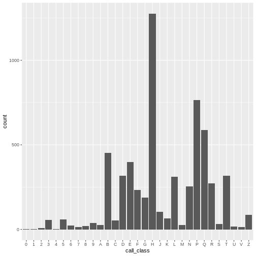
We can see that there are about 1,500 books in the H class, 1,000 books in the P class, 700 books in the E class, etc. As we shall see, the number of E and F books are deceptively large, as easy books and fiction books both begin with E and are thus lumped into that category, though they are not of the E and F Library of Congress call number classification.
ggplottips
- Anything you put in the
ggplot()function can be seen by any geom layers that you add (i.e., these are universal plot settings). This includes the x- and y-axis mapping you set up inaes(). - You can also specify mappings for a given geom independently of the
mapping defined globally in the
ggplot()function. - The
+sign used to add new layers must be placed at the end of the line containing the previous layer. If, instead, the+sign is added at the beginning of the line containing the new layer,ggplot2will not add the new layer and will return an error message.
Univariate geoms
“Univariate” refers to a single variable. A histogram is a
univariate plot: it shows the frequency counts of each value inside a
single variable. Let’s say we want to visualize a frequency distibution
of checkouts in the booksPlot data. In other words, how
many items have 1 checkout? How many have 2 checkouts? And so on.
R
ggplot(data = booksPlot, mapping = aes(x = tot_chkout)) +
  geom_histogram()
OUTPUT
`stat_bin()` using `bins = 30`. Pick better value with `binwidth`.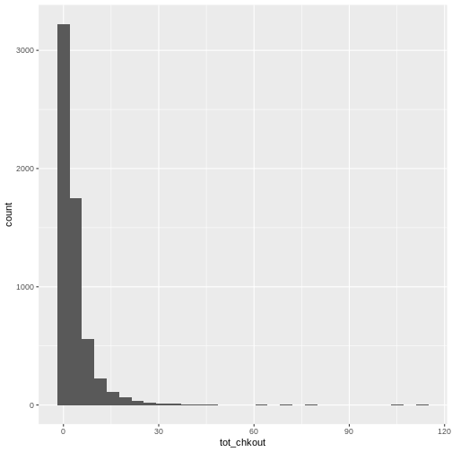
As we have seen in previous lessons, the overwhelming majority of books have a small amount of usage, so the plot is heavily skewed. As anyone who has done collection analysis has encountered, this is a very common issue. It can be addressed in two ways:
First, add a binwidth argument to aes(). In
a histogram, each bin contains the number of occurrences of items in the
data set that are contained within that bin. As stated in the
documentation for ?geom_histogram, “You should always
override this value, exploring multiple widths to find the best to
illustrate the stories in your data.”
Second, change the scales of the y axes by adding
another argument to ggplot:
R
ggplot(data = booksPlot) +
  geom_histogram(aes(x = tot_chkout), binwidth = 10) +
  scale_y_log10()
WARNING
Warning: Transformation introduced infinite values in continuous y-axisWARNING
Warning: Removed 2 rows containing missing values (`geom_bar()`).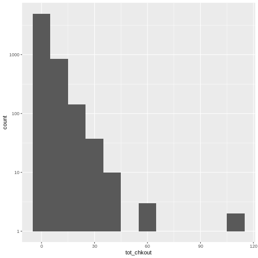
Notice the scale y axis now goes from 0-10, 10-100, 100-1000, and 1000-10000. This is called “logarithmic scale” and is based on orders of magnitude. We can therefore see that over 5,000 books (on the y axis) have between 0-10 checkouts (on the x axis), 1,000 books have 10-20 checkouts, and further down on the x axis, a handful of books have 60-70 checkouts, and a handful more have around 100 checkouts.
We can check this with table():
R
table(booksPlot$tot_chkout)
OUTPUT
   0    1    2    3    4    5    6    7    8    9   10   11   12   13   14   15
2348  875  638  464  362  282  199  146  118   97   84   50   41   46   40   33
  16   17   18   19   20   21   22   23   24   25   26   27   28   29   30   31
  17   20   26   17   14   12    7   15    7    8    6    6    3    3    2    4
  32   33   34   35   36   38   39   40   41   43   47   61   63   69   79  106
   1    5    4    3    2    2    3    1    1    1    1    1    2    1    1    1
 113
   1
ggplot has thus given us an easy way to visualize the distribution of checkouts. If you test this on your own print and ebook usage data, you will likely find something similar.
Changing the geom
This same exact data can be visualized in a couple different ways by
replacing the geom_histogram() function with either
geom_density() (adding a logarithmic x scale) or
geom_freqpoly():
R
# create a density plot
ggplot(data = booksPlot) +
  geom_density(aes(x = tot_chkout)) +
  scale_y_log10() +
  scale_x_log10()
WARNING
Warning: Transformation introduced infinite values in continuous x-axisWARNING
Warning: Removed 2348 rows containing non-finite values (`stat_density()`).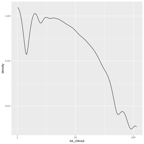
R
# create a frequency polygon
ggplot(data = booksPlot) +
  geom_freqpoly(aes(x = tot_chkout), binwidth = 30) +
  scale_y_log10()
WARNING
Warning: Transformation introduced infinite values in continuous y-axis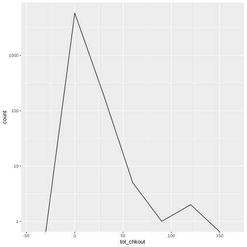
Bivariate geoms
Bivariate plots visualize two variables. Let’s take a look at some
higher usage items, but first eliminate the NA values and
keep only items with more than 10 checkouts, which we will do with
filter() from the dplyr package and assign it
to booksHighUsage
R
# filter booksPlot to include only items with over 10 checkouts
booksHighUsage <- booksPlot %>%
  filter(!is.na(tot_chkout),
                tot_chkout > 10)
We then visualize checkouts by call number with a scatter plot. There
is still so much skew that I retain the logarithmic scale on the y axis
with scale_y_log10().
R
# scatter plot high usage books by call number class
ggplot(data = booksHighUsage,
       aes(x = call_class, y = tot_chkout)) +
  geom_point() +
  scale_y_log10()
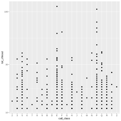
Again, notice the scale on the y axis. We can obseve a few items of
interest here: No items in the D, J, M, and Z class have more than 30
checkouts. An item in the E class has the most checkouts with over 100,
but, as noted above, this includes Easy books classified with
E, not just items with Library of Congress E
classification (United States history) an issue we’ll look at further
down.
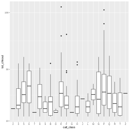
Just as with univariate plots, we can use different geoms to view various aspects of the data, which in turn reveal different patterns.
R
# boxplot plot high usage books by call number class
ggplot(data = booksHighUsage,
       aes(x = call_class, y = tot_chkout)) +
  geom_boxplot() +
  scale_y_log10()
By adding points to a boxplot, we can have a better idea of the
number of measurements and of their distribution. Here we set the
boxplot alpha to 0, which will make it
see-through. We also add another layer of geom to the plot called
geom_jitter(), which will introduce a little bit of
randomness into the position of our points. We set the
color of these points to "tomato".
R
ggplot(data = booksHighUsage, aes(x = call_class, y = tot_chkout)) +
  geom_boxplot(alpha = 0) +
  geom_jitter(alpha = 0.5, color = "tomato") +
  scale_y_log10()
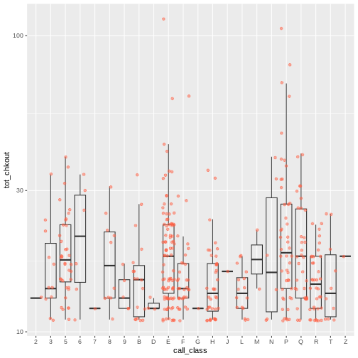
Notice how the boxplot layer is behind the jitter layer? What do you need to change in the code to put the boxplot in front of the points such that it’s not hidden?
Plotting Exercise
Boxplots are useful summaries, but hide the shape of the distribution. For example, if the distribution is bimodal, we would not see it in a boxplot. An alternative to the boxplot is the violin plot, where the shape (of the density of points) is drawn.
- Replace the box plot with a violin plot; see
geom_violin().
R
ggplot(data = booksHighUsage, aes(x = call_class, y = tot_chkout)) +
  geom_violin(alpha = 0) +
  geom_jitter(alpha = 0.5, color = "tomato")
WARNING
Warning: Groups with fewer than two data points have been dropped.
Groups with fewer than two data points have been dropped.
Groups with fewer than two data points have been dropped.
Groups with fewer than two data points have been dropped.
Groups with fewer than two data points have been dropped.
R
ggplot(data = booksHighUsage, aes(x = call_class, y = tot_chkout)) +
geom_violin(alpha = 0) +
geom_jitter(alpha = 0.5, aes(color = subCollection)) +
scale_y_log10()
WARNING
Warning: Groups with fewer than two data points have been dropped.
Groups with fewer than two data points have been dropped.
Groups with fewer than two data points have been dropped.
Groups with fewer than two data points have been dropped.
Groups with fewer than two data points have been dropped.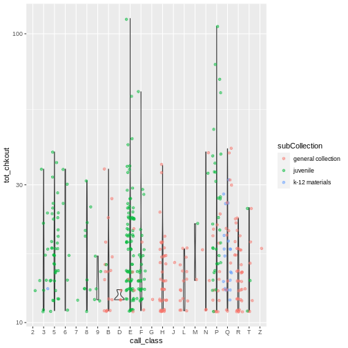
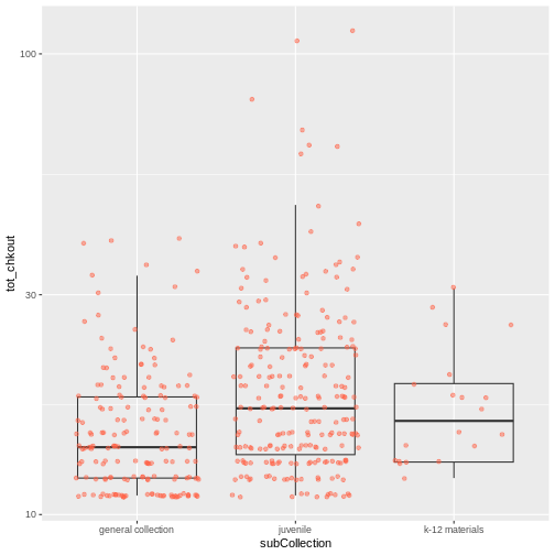
Plotting Exercise(continued)
So far, we’ve looked at the distribution of checkouts within call number ranges. Try making a new plot to explore the distribution of checkouts within another variable.
- Still using the
booksHighUsagedata, create a boxplot fortot_chkoutfor eachsubCollection. Overlay the boxplot layer on a jitter layer to show actual measurements. Keep thescale_y_log10argument.
R
ggplot(data = booksHighUsage, aes(x = subCollection, y = tot_chkout)) +
 geom_boxplot(alpha = 0) +
 geom_jitter(alpha = 0.5, color = "tomato") +
 scale_y_log10()
Add a third variable
As we saw in that exercise, you can convey even more information in your visualization by adding a third variable, in addition to the first two on the x and y scales.
Add a third variable with aes()
We can use arguments in aes() to map a visual aesthetic
in the plot to a variable in the dataset. Specifically, we will map
color to the subCollection variable. Because
we are now mapping features of the data to a color, instead of setting
one color for all points, the color now needs to be set inside a call to
the aes function.
ggplot2 will provide a different color
corresponding to different values in the vector. In other words,
associate the name of the aesthetic (color) to the name of
the variable (subCollection) inside aes():
R
ggplot(data = booksHighUsage,
       aes(x = call_class,
           y = tot_chkout,
           color = subCollection)) +
  geom_point() +
  scale_y_log10()
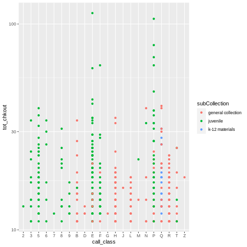
ggplot() automatically assigns a unique level of the
aesthetic to each unique value of the variable (this is called
scaling). Now we reveal indeed that youth materials make up a
large number of high usage items in both the E and the P class.
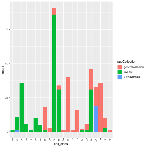
Use fill() with geom_bar() to create a
stacked bar plot to visualize frequency. Again, this reinforced the fact
that most of the E and P classification are
youth materials.
R
ggplot(data = booksHighUsage, aes(x = call_class)) +
  geom_bar(aes(fill = subCollection))
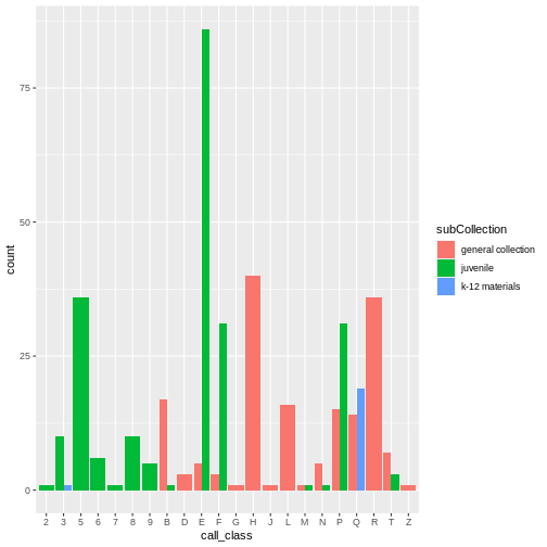
Stacked bar charts are generally more difficult to read than
side-by-side bars. We can separate the portions of the stacked bar that
correspond to each village and put them side-by-side by using the
position argument for geom_bar() and setting
it to “dodge”.
R
ggplot(data = booksHighUsage, aes(x = call_class)) +
  geom_bar(aes(fill = subCollection), position = "dodge")
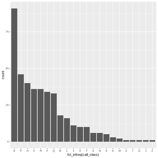
The order of the classification scale is sorted for “library order.”
The audience of library professionals typically prefer an alphabetical
arrangement. However, the x-axis variable is actually categorical.
Categorical data are easier to read when the bars are sorted by
frequency. An easy way to sort by frequency is to use the
fct_infreq() function from the forcats
library.
R
ggplot(data = booksHighUsage, aes(x = fct_infreq(call_class))) +
  geom_bar()
Another visualization issue is labeling. In many cultures, long
labels are easier to read horizontally. Our goal is to flip the x-axis
and reorient the x-axis labels into a horizontal presentation. To
accomplish this, flip the axis coordinates with the
coord_flip() function. When we flip the axes it’s important
to reverse the sorted categorical order. Do this with
forcats::fct_rev().
R
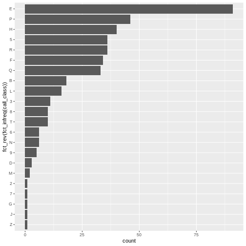
ggplot(data = booksHighUsage, aes(x = fct_rev(fct_infreq(call_class)))) +
  geom_bar() +
  coord_flip()
Plotting time series data
Let’s calculate number of counts per year for each format for items
published after 1990 and before 2002 in the booksHighUsage
data frame created above.
First, we use the ymd() function from the
lubridate package to convert our publication year into a
POSIXct object. Pass the truncated = 2 argument as
a way to indicate that the pubyear column does not contain
month or day. This means 1990 becomes
1990-01-01. This will allow us to plot the number of books
per year.
We will do this by calling mutate() to create a new
variable pubyear_ymd.
R
booksPlot <- booksPlot %>%
  mutate(pubyear_ymd = ymd(pubyear, truncated = 2))  # convert pubyear to a Date object with ymd()

class(booksPlot$pubyear)  # integer
OUTPUT
[1] "numeric"R
class(booksPlot$pubyear_ymd) # Date
OUTPUT
[1] "Date"Next we can use filter to remove the NA
values and get books published between 1990 and 2003. Notice that we use
the & as an AND operator to indicate that the date must
fall between that range. We then need to group the data and count
records within each group.
R
yearly_counts <- booksPlot %>%
  filter(!is.na(pubyear_ymd),
         pubyear_ymd > "1989-01-01" & pubyear_ymd < "2002-01-01") %>%
  count(pubyear_ymd, subCollection)
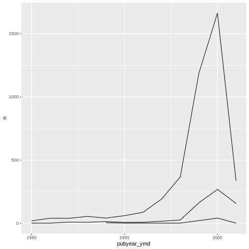
Time series data can be visualized as a line plot with years on the x axis and counts on the y axis:
R
ggplot(data = yearly_counts, mapping = aes(x = pubyear_ymd, y = n)) +
     geom_line()

Unfortunately, this does not work because we plotted data for all the
sub-collections together. We need to tell ggplot to draw a line for each
sub-collection by modifying the aesthetic function to include
group = subCollection:
R
ggplot(data = yearly_counts, mapping = aes(x = pubyear_ymd, y = n, group = subCollection)) +
    geom_line()
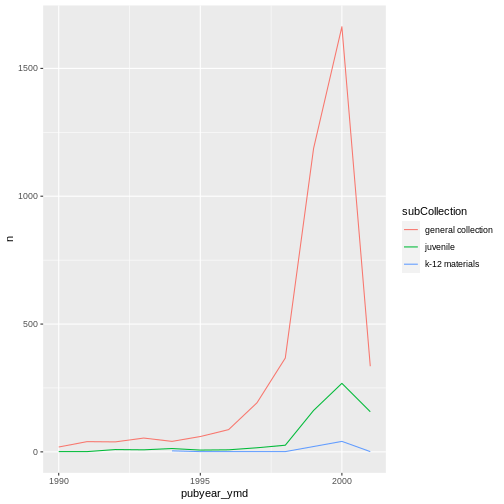
We will be able to distinguish sub-collections in the plot if we add
colors (using color also automatically groups the
data):
R
ggplot(data = yearly_counts, mapping = aes(x = pubyear_ymd, y = n, color = subCollection)) +
  geom_line()
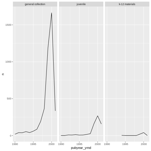
Add a third variable with facets
Rather than creating a single plot with side-by-side bars for each sub-collection, we may want to create multiple plots, where each plot shows the data for a single sub-collection. This would be especially useful if we had a large number of sub-collections that we had sampled, as a large number of side-by-side bars will become more difficult to read.
ggplot2 has a special technique called
faceting that allows the user to split one plot into multiple
plots based on a factor included in the dataset.
There are two types of facet functions:
-
facet_wrap()arranges a one-dimensional sequence of panels to allow them to cleanly fit on one page. -
facet_grid()allows you to form a matrix of rows and columns of panels.
Both geometries allow to to specify faceting variables specified
within vars(). For example,
facet_wrap(facets = vars(facet_variable)) or
facet_grid(rows = vars(row_variable), cols = vars(col_variable)).
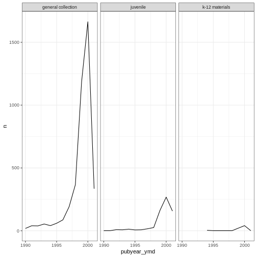
Here we use facet_wrap() to make a time series plot for
each subCollection
R
ggplot(data = yearly_counts, mapping = aes(x = pubyear_ymd, y = n)) +
    geom_line() +
    facet_wrap(facets = vars(subCollection))
We can use facet_wrap() as a way of seeing the
categories within a variables. Look at the number of formats per
sub-collection.
R
ggplot(data = books2, aes(x = fct_rev(fct_infreq(subCollection)))) +
  geom_bar() +
  facet_wrap(~ format, nrow = 2) +
  scale_y_log10() +
  coord_flip() +
  labs(x = "Library subcollection", y = "")
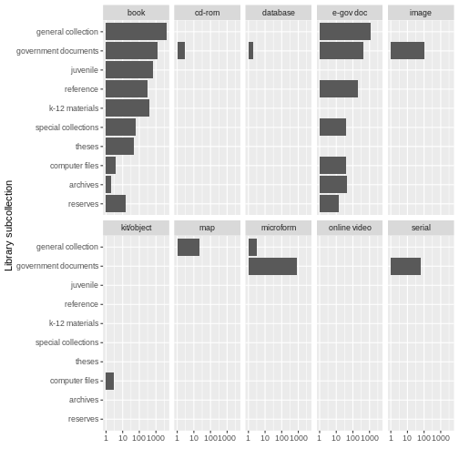
While this may not be the most beautiful plot, these kinds of exercises can be helpful for data exploration. We learn that there are books in all sub-collections; there are CD-ROMS, serials, images, and microforms in government documents, and so on. Exploratory plots visually surface information about your data that are otherwise difficult to parse. Sometimes they may not meet all the rules for creating beautiful data, but when you are simply getting to know your data, that’s OK.
Challenge
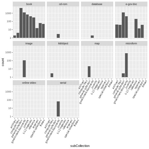
Use the books2 data to create a bar plot that depicts
the number of items in each sub-collection, faceted by format. Add the
scale_y_log10() argument to create a logarithmic scale for easier
visibility. Add the following theme argument to tilt the axis text
diagonal:
theme(axis.text.x = element_text(angle = 60, hjust = 1))
R
ggplot(data = books2, aes(x = subCollection)) +
geom_bar() +
facet_wrap(vars(format)) +
scale_y_log10() +
theme(axis.text.x = element_text(angle = 60, hjust = 1))
ggplot2 themes
Usually plots with white background look more readable when printed.
Every single component of a ggplot graph can be customized
using the generic theme() function. However, there are
pre-loaded themes available that change the overall appearance of the
graph without much effort.
For example, we can change our graph to have a simpler white
background using the theme_bw() function:
R
#
ggplot(data = yearly_counts, mapping = aes(x = pubyear_ymd, y = n)) +
  geom_line() +
  facet_wrap(facets = vars(subCollection)) +
  theme_bw()
In addition to theme_bw(), which changes the plot
background to white, ggplot2 comes with
several other themes which can be useful to quickly change the look of
your visualization. The complete list of themes is available at https://ggplot2.tidyverse.org/reference/ggtheme.html.
theme_minimal() and theme_light() are popular,
and theme_void() can be useful as a starting point to
create a new hand-crafted theme.
The ggthemes
package provides a wide variety of options. The ggplot2
extensions website provides a list of packages that extend the
capabilities of ggplot2, including
additional themes.
Customization
Take a look at the ggplot2
cheat sheet, and think of ways you could improve your plots.
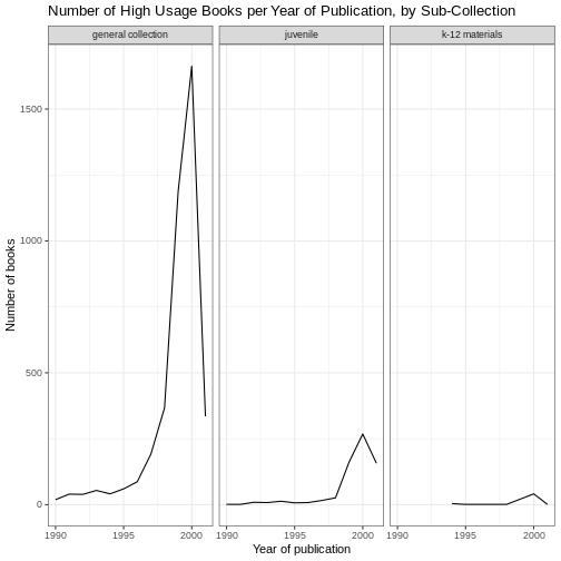
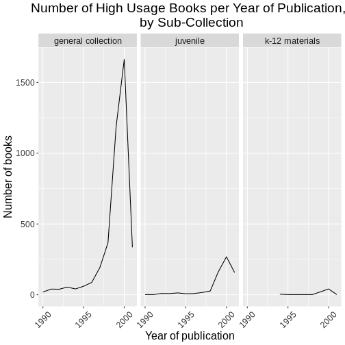
For example, by default, the axes labels on a plot are determined by the name of the variable being plotted. We can change names of axes to something more informative than ‘pubyear_ymd’ and ‘n’ and add a title to the figure:
R
# add labels
ggplot(data = yearly_counts, mapping = aes(x = pubyear_ymd, y = n)) +
  geom_line() +
  facet_wrap(facets = vars(subCollection)) +
  theme_bw() +
    labs(title = "Number of High Usage Books per Year of Publication, by Sub-Collection",
        x = "Year of publication",
        y = "Number of books")
Note that it is also possible to change the fonts of your plots. If
you are on Windows, you may have to install the extrafont
package, and follow the instructions included in the README for this
package.
You can also assign a theme to an object in your
environment, and pass that theme to your plot. This can be helpful to
keep your ggplot() calls less cluttered. Here we create a
gray_theme :
R
# create the gray theme
gray_theme <- theme(axis.text.x = element_text(color = "gray20", size = 12, angle = 45, hjust = 0.5, vjust = 0.5),
                    axis.text.y = element_text(color = "gray20", size = 12),
                    text = element_text(size = 16),
                    plot.title = element_text(hjust = 0.5))

# pass the gray theme to a plot
ggplot(data = yearly_counts, mapping = aes(x = pubyear_ymd, y = n)) +
  geom_line() +
  facet_wrap(facets = vars(subCollection)) +
  gray_theme +
  labs(title = "Number of High Usage Books per Year of Publication, \n by Sub-Collection",
        x = "Year of publication",
        y = "Number of books")
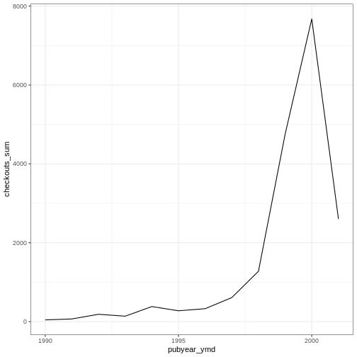
Challenge
Use the booksPlot data to create a plot that depicts how
the total number of checkouts changes based on year of publication.
First, create a data frame yearly_checkouts That meets
the following conditions:
-
filter()to excludeNAvalues -
filter()between “1989-01-01” and “2002-01-01” -
group_by()the publication year (make sure to use the special Date pubyear value we created) -
summarize()to create a new valuecheckouts_sumthat represents thesum()of total checkouts per publication year
Then, create a ggplot that visualizes the sum of item
checkouts by year of publication. Add one of the themes listed
above.
R
yearly_checkouts <- booksPlot %>%
 filter(!is.na(pubyear_ymd),
        pubyear_ymd > "1989-01-01" & pubyear_ymd < "2002-01-01") %>%
 group_by(pubyear_ymd) %>%
 summarize(checkouts_sum = sum(tot_chkout))

ggplot(data = yearly_checkouts, mapping = aes(x = pubyear_ymd, y = checkouts_sum)) +
 geom_line() +
 theme_bw()
Save and export
After creating your plot, you can save it to a file in your favorite format. The Export tab in the Plot pane in RStudio will save your plots at low resolution, which will not be accepted by many journals and will not scale well for posters.
Instead, use the ggsave() function, which allows you
easily change the dimension and resolution of your plot by adjusting the
appropriate arguments (width, height and
dpi). We have been printing our plot output directly to the
console. To use ggsave(), first assign the plot to a
variable in your R environment, such as
yearly_counts_plot.
Make sure you have the fig_output/ folder in your
working directory.
R
yearly_counts_plot <- ggplot(data = yearly_counts, mapping = aes(x = pubyear_ymd, y = n)) +
  geom_line() +
  facet_wrap(facets = vars(subCollection)) +
  gray_theme +
  labs(title = "Number of High Usage Books per Year of Publication, \n by Sub-Collection",
        x = "Year of publication",
        y = "Number of books")

ggsave("fig_output/yearly_counts_plot.png", yearly_counts_plot, width = 15, height = 10)
Exercise
With all of this information in hand, please take another five
minutes to either improve one of the plots generated in this exercise or
create a beautiful graph of your own. Use the RStudio ggplot2
cheat sheet for inspiration. Here are some ideas:
- See if you can make the bars white with black outline.
- Try using a different color palette (see http://www.cookbook-r.com/Graphs/Colors_(ggplot2)/).
Key Points
-
ggplot2is a flexible and useful tool for creating plots in R. - The data set and coordinate system can be defined using the
ggplotfunction. - Additional layers, including geoms, are added using the
+operator. - Boxplots are useful for visualizing the distribution of a continuous variable.
- Barplot are useful for visualizing categorical data.
- Faceting allows you to generate multiple plots based on a categorical variable.