Overview
Teaching: 40 min
Exercises: 30 minQuestions
How does it all tie in together?
Objectives
To consolidate episodes on data cleaning and manipulation
To introduce plotting with the Matplotlib library
Putting it all together
Up to this point, we have walked through tasks that are often
involved in handling and processing data using the workshop ready partly cleaned
files that we have provided.
In this consolidation exercise, we will perform many of the same tasks as before but start by doing some further cleaning of the dataset. This lesson also covers data visualization.
This lesson does not give step-by-step directions to each of the tasks. Use the lesson materials you’ve already gone through as well as the Python documentation to help you along.
1. Obtain data
There are many repositories online from which you can obtain data. We are continuing with the articles dataset we have been using so far, but feel free to use any data that is relevant to your research.
The articles dataset is available, as before, on Figshare.
Download this zip file (if you haven’t done so already) and extract to a suitable location.
You will recall that this data set (in articles.csv) is a list of published articles. The dataset is stored as .csv (comma separated values) files and each row holds information for a single article.
2. Clean up your data and open it using Python and Pandas
To begin, import your data file into Python using Pandas. Using read.csv, Panda’s default action is to read the first row as a header row.
Is that what we want in this case?
If you are having trouble importing the data as a table using Pandas, check the documentation. You can open the docstring (the basic help documentation) in an Jupyter notebook using a question mark. For example:
import pandas as pd
pd.read_csv?
From earlier episodes we know that this file contains a number of columns but not all of them might be useful to us. We now need to import the data and create a DataFrame that includes only the the data we need to use.
For these exercises, we need to import just:
Title, Authors, Subject, Citation, LanguageId, First_Author, Citation_Count, Day, Month, Year
For example, to import just Title and Authors:
pd.read_csv("articles.csv", usecols=['Title', 'Authors'])
And to create a single Publication_date column from the individual Day, Month and Year columns during import:
articles_df = pd.read_csv("articles.csv",
                          parse_dates={'Publication_date': ['Year', 'Month', 'Day']}, keep_date_col=True)
Once imported, we can check the new Publication_date column against the original
Day, Month, Year columns to make sure the dates are the same.
And then check the data type of the new column:
articles_df.dtypes
Publication_date    datetime64[ns]
id                           int64
Title                       object
Authors                     object
Subjects                    object
Citation                    object
LanguageId                   int64
First_Author                object
Citation_Count               int64
Day                         object
Month                       object
Year                        object
dtype: object
You’ll notice that the Authors column actually contains several author names separated by the | character. As a first analysis, we would like to find out how many author credits each single author has in the whole dataset, irrespective of whether they are first, second or subsequent authors.
We could do it like this:
We need to split up the Authors to create a new Author column
articles_df.Authors.map(lambda x: x.split('|'))
0                       [Flavia Pennini, Angelo Plastino]
1                           [Naveed Aslam, Peter C. Wynn]
2       [Rafael R. C. Cuadrat, Juliano C. Cury, Albert...
3       [Fabrizio Ortu, Hao Zhu, Marie-Emmanuelle Boul...
and then make a duplicate of each row with this new author column at the end. If a book has three authors the new dataframe will have three rows for that book entry, one for each author.
s = articles_df.Authors.map(lambda x: x.split('|')).apply(pd.Series).unstack()
df2 = articles_df.join(pd.DataFrame(s.reset_index(level=0, drop=True)))
df2.rename(columns={0: 'Author'}, inplace=True)
df2.dropna(subset=['Author'], inplace=True)
We now have many occurences for each author name. we need to aggregate and count these.
df2.groupby(by='Author').Title.count().sort_values(ascending=False)
Author
Mehmet Akkurt                39
Shaaban K. Mohamed           30
Mustafa R. Albayati          27
Lahcen El Ammari             27
Mohamed Saadi                27
Edward R. T. Tiekink         25
3. Make plots of your data
Matplotlib is a Python library that can be used to visualize data. The toolbox matplotlib.pyplot is a collection of functions that make matplotlib work like MATLAB. In most cases, this is all that you will need to use, but there are many other useful tools in matplotlib that you should explore.
We will cover a few basic commands for formatting plots in this lesson. A great resource for help styling your figures is the matplotlib gallery http://matplotlib.org/gallery.html, which includes plots in many different styles and the source code that creates them. The simplest of plots is the 2 dimensional line plot. These examples walk through the basic commands for making line plots using pyplots.
Using pyplot:
First, import the pyplot toolbox:
import matplotlib.pyplot as plt
By default, matplotlib will create the figure in a separate window. When using ipython notebooks, we can make figures appear in-line within the notebook by writing:
%matplotlib inline
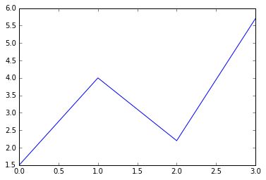
We can start by plotting the values of a list of numbers (matplotlib can handle many types of numeric data, including numpy arrays and pandas DataFrames - we are just using a list as an example!):
list_numbers = [1.5, 4, 2.2, 5.7]
plt.plot(list_numbers)
plt.show()
The command plt.show() prompts Python to display the figure. Without it, it creates an object in memory but doesn’t produce a visible plot. The Jupyter notebooks (if using %matplotlib inline) will automatically show you the figure even if you don’t write plt.show(), but get in the habit of including this command!
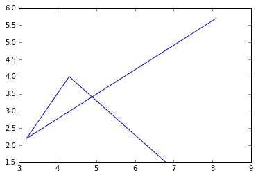
If you provide the plot() function with only one list of numbers, it assumes that it is a sequence of y-values and plots them against their index (the first value in the list is plotted at x=0, the second at x=1, etc). If the function plot() receives two lists, it assumes the first one is the x-values and the second the y-values. The line connecting the points will follow the list in order:
plt.plot([6.8, 4.3, 3.2, 8.1], list_numbers)
plt.show()
A third, optional argument in plot() is a string of characters that indicates the line type and color for the plot. The default value is a continuous blue line. For example, we can make the line red (‘r’), with circles at every data point (‘o’), and a dot-dash pattern (’-.’). Look through the matplotlib gallery for more examples.
plt.plot([6.8, 4.3, 3.2, 8.1], list_numbers, 'ro-.')
plt.axis([0,10,0,6])
plt.show()
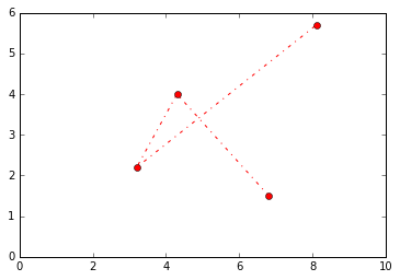
The command plt.axis() sets the limits of the axes from a list of [xmin, xmax, ymin, ymax] values (the square brackets are needed because the argument for the function axis() is one list of values, not four separate numbers!). The functions xlabel() and ylabel() will label the axes, and title() will write a title above the figure.
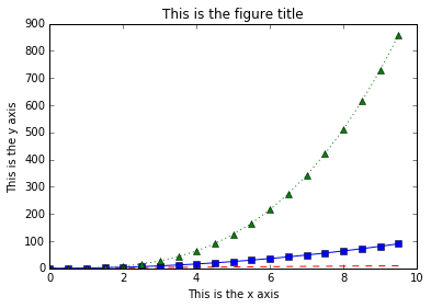
A single figure can include multiple lines, and they can be plotted using the same plt.plot() command by adding more pairs of x values and y values (and optionally line styles):
import numpy as np

# create a numpy array between 0 and 10, with values evenly spaced every 0.5
t = np.arange(0., 10., 0.5)

# red dashes with no symbols, blue squares with a solid line, and green triangles with a dotted line
plt.plot(t, t, 'r--', t, t**2, 'bs-', t, t**3, 'g^:')

plt.xlabel('This is the x axis')
plt.ylabel('This is the y axis')
plt.title('This is the figure title')

plt.show()
We can include a legend by adding the optional keyword argument label=’’ in plot(). Caution: We cannot add labels to multiple lines that are plotted simultaneously by the plt.plot() command like we did above because Python won’t know to which line to assign the value of the argument label. Multiple lines can also be plotted in the same figure by calling the plot() function several times:
# red dashes with no symbols, blue squares with a solid line, and green triangles with a dotted line
plt.plot(t, t, 'r--', label='linear')
plt.plot(t, t**2, 'bs-', label='square')
plt.plot(t, t**3, 'g^:', label='cubic')

plt.legend(loc='upper left', shadow=True, fontsize='x-large')

plt.xlabel('This is the x axis')
plt.ylabel('This is the y axis')
plt.title('This is the figure title')

plt.show()
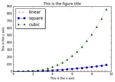
The function legend() adds a legend to the figure, and the optional keyword arguments change its style. By default [typing just plt.legend()], the legend is on the upper right corner and has no shadow.
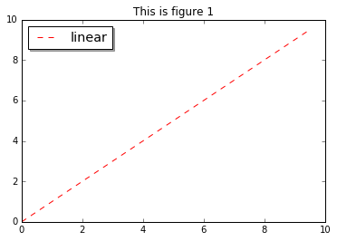
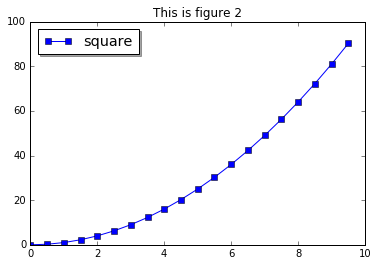
Like MATLAB, pyplot is stateful; it keeps track of the current figure and plotting area, and any plotting functions are directed to those axes. To make more than one figure, we use the command plt.figure() with an increasing figure number inside the parentheses:
# this is the first figure
plt.figure(1)
plt.plot(t, t, 'r--', label='linear')

plt.legend(loc='upper left', shadow=True, fontsize='x-large')
plt.title('This is figure 1')

plt.show()

# this is a second figure
plt.figure(2)
plt.plot(t, t**2, 'bs-', label='square')

plt.legend(loc='upper left', shadow=True, fontsize='x-large')
plt.title('This is figure 2')

plt.show()
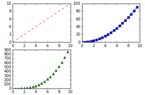
A single figure can also include multiple plots in a grid pattern. The subplot() command especifies the number of rows, the number of columns, and the number of the space in the grid that particular plot is occupying:
plt.figure(1)

plt.subplot(2,2,1) # two row, two columns, position 1
plt.plot(t, t, 'r--', label='linear')

plt.subplot(2,2,2) # two row, two columns, position 2
plt.plot(t, t**2, 'bs-', label='square')

plt.subplot(2,2,3) # two row, two columns, position 3
plt.plot(t, t**3, 'g^:', label='cubic')

plt.show()
All of this is fine for numerical data, but we have both textual and numerical data in our Dataframe. Let’s consider some ways we might visualise this.
Example 1. Create a bar chart of the number of authorships for the ‘top ten’ authors.
Example 2. Create a bar chart of the number of authors per paper (number of authors on the x-axis and count of papers on the y-axis), so how many papers have 5 authors, 4 authors, 3 authors etc.
Challenge
What other bar charts and line plots can you make from this data? Add axis labels, titles, and legends to your figures. Make at least one figure with multiple plots using the function subplot().
4. Make other types of plots:
Matplotlib can make many other types of plots in much the same way that it makes 2 dimensional line plots. Look through the examples in http://matplotlib.org/users/screenshots.html and try a few of them (click on the “Source code” link and copy and paste into a new cell in ipython notebook or save as a text file with a .py extension and run in the command line).
Challenge
Display your data using one or more plot types from the example gallery. Which ones to choose will depend on the content of your own data file. If you are using the articles dataset, you could plot a histogram of frequencies of to 10 or 20 most common subject keywords, create a scatter plot to investigate (say) the correlation between subject number of citations, or explore the different ways matplotlib can handle time series data.
Key Points
Load data.
Clean data.
Show data.